
-
PRODUCTS
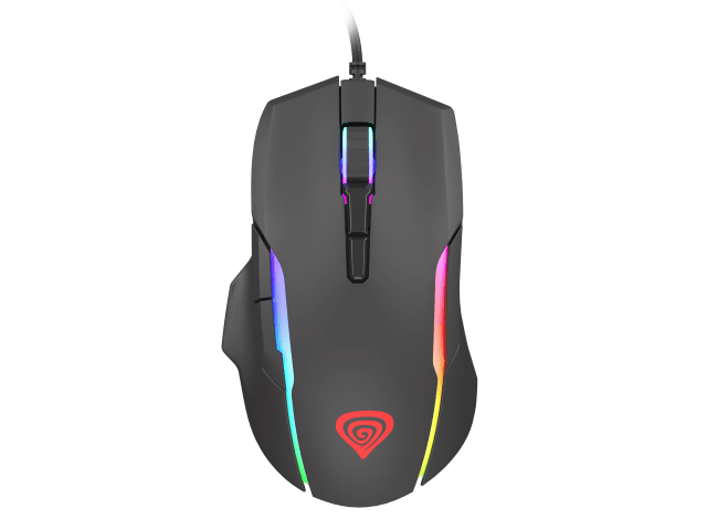
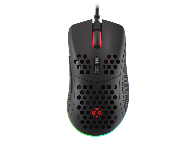
- Mice
-
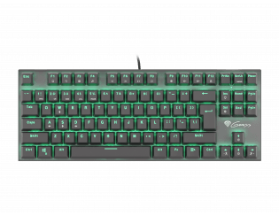
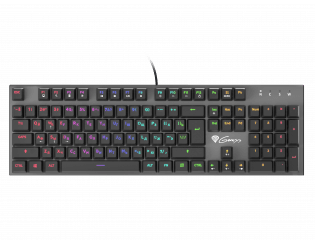
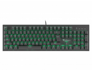
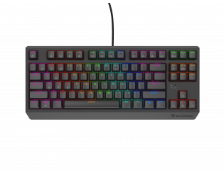
Keyboards
-
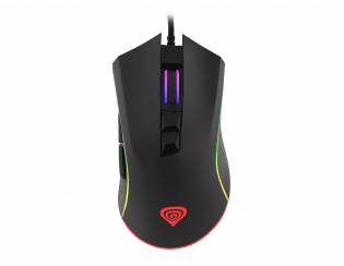
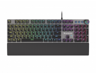
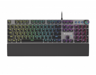
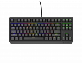
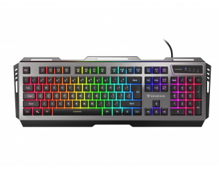
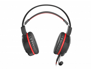
RX85 RGB

-
Thor 660 GATERON RED
-
Thor 660 GATERON BROWN
-
Thor 420 RGB
-
Thor 404 TKL KAILH
-
Thor 404 TKL GATERON
-
Thor 401 RGB
-
Thor 400 RGB
-
Thor 380 RGB
-
Thor 303 TKL Silent Switch
-
Thor 303 TKL
-
Thor 303 Silent Switch
-
Thor 303
-
Thor 300 TKL
-
Thor 300 RGB Limited US/RU
-
Thor 300 RGB
-
Thor 300
-
Thor 230 TKL Wireless
-
Thor 230 TKL Lite
-
Thor 230 TKL
-
Thor 210 RGB
-
Thor 100 RGB
-
Lith 400 RGB
-
Rhod 500 RGB
-
Rhod 420 RGB
-
Rhod 410
-
Rhod 400 RGB
-
Rhod 350 RGB
-
Rhod 300 RGB
-
Rhod 110
-
Cobalt 330 RGB
-
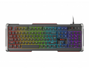
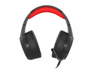
RX85 RGB
- Keyboard accessories
-
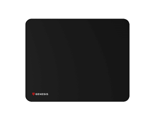
Mousepads
-
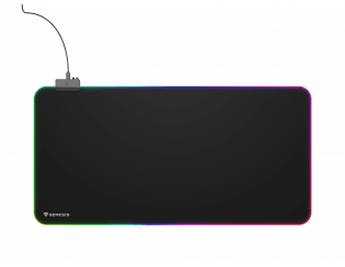
Boron 500 XXL RGB
-
Carbon 700 XL Cordura®
-
Carbon 700 MAXI Cordura®
-
Carbon 500 XL LOGO
-
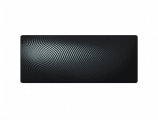
Carbon 500 Ultra Wave
-
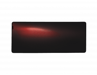
Carbon 500 Ultra Blaze
-
Carbon 500 S LOGO
-
Carbon 500 Maxi WOWS Błyskawica
-
Carbon 500 MAXI WOWS Armada
-
Carbon 500 MAXI LOGO
-
Carbon 500 MAXI LAVA G2
-
Carbon 500 MAXI FLASH G2
-
Carbon 500 M WOWS Błyskawica
-
Carbon 500 M WOWS Armada
-
Carbon 500 M STEEL G2
-
Carbon 500 M LOGO
-
Carbon 500 M FIRE G2
-
Carbon 500 M FIRE
-
Carbon 500 L RISE
-
Carbon 500 L LOGO
-
Carbon 400 XXL LOGO
-
Carbon 400 M LOGO
-
Polon 200 XL
-
Polon 200 L
-
Boron 500 XXL RGB
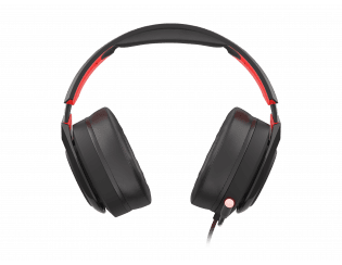
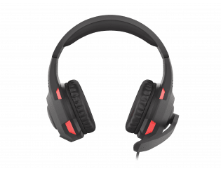
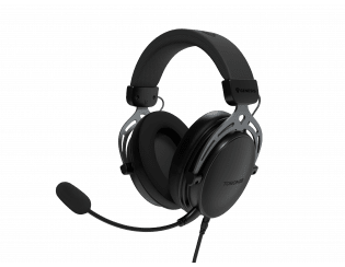
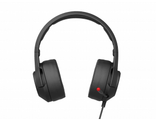
- Headphones
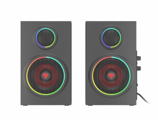
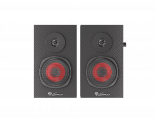
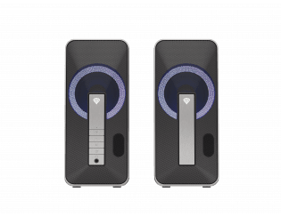
- Speakers
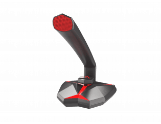
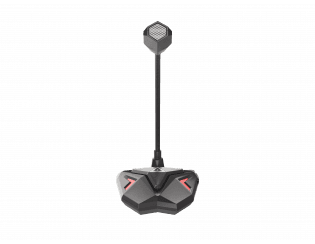
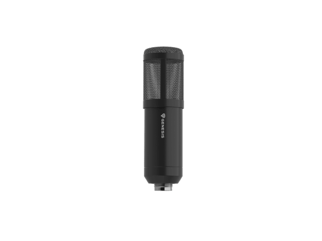
- Microphones
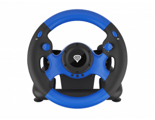
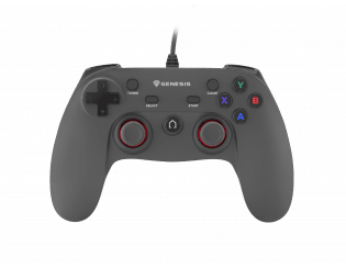
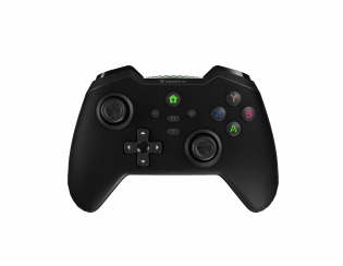
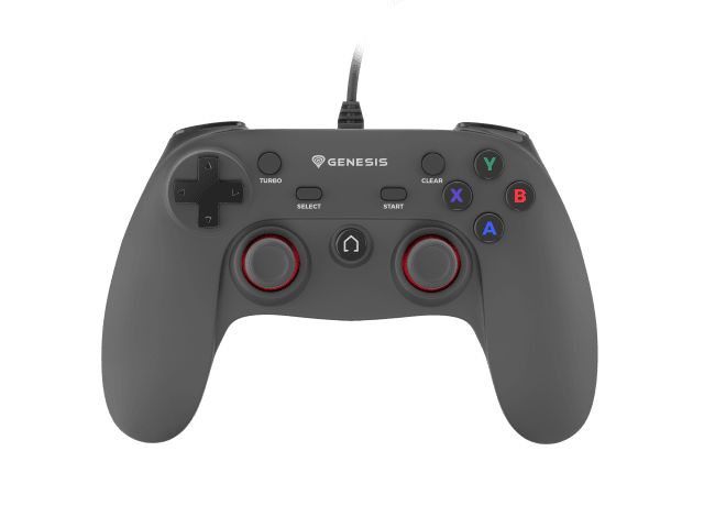
- Controllers
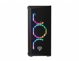
- PC Cases
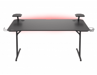
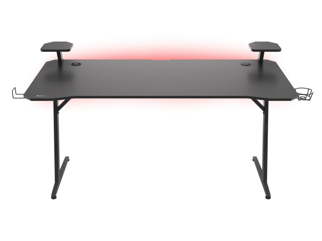
- Gaming desk
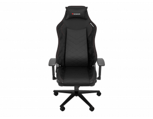
- Gaming Chairs
- Backpacks
- Accessories
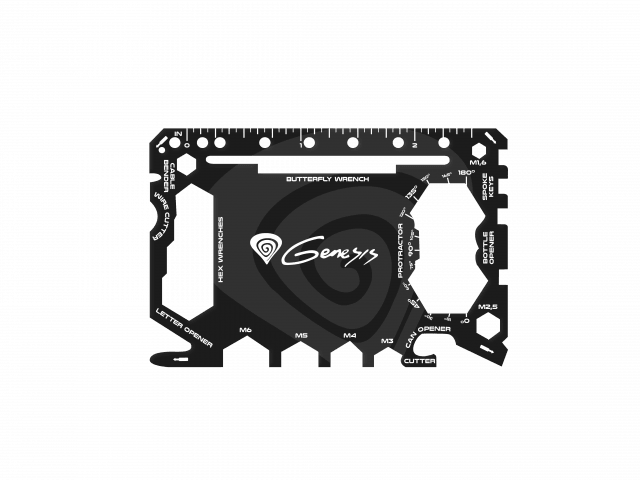
- Gadgets
- SUPPORT
- Contact
- Shop


-
[[ quantity ]]
Your cart
Value of purchases: [[ amountFormatted ]]Product Price[[ line.name ]][[ line.promotion ]][[ line.amountFormatted ]][[ line.quantity ]] x [[ line.priceFormatted ]]Your cart is empty ☹
-


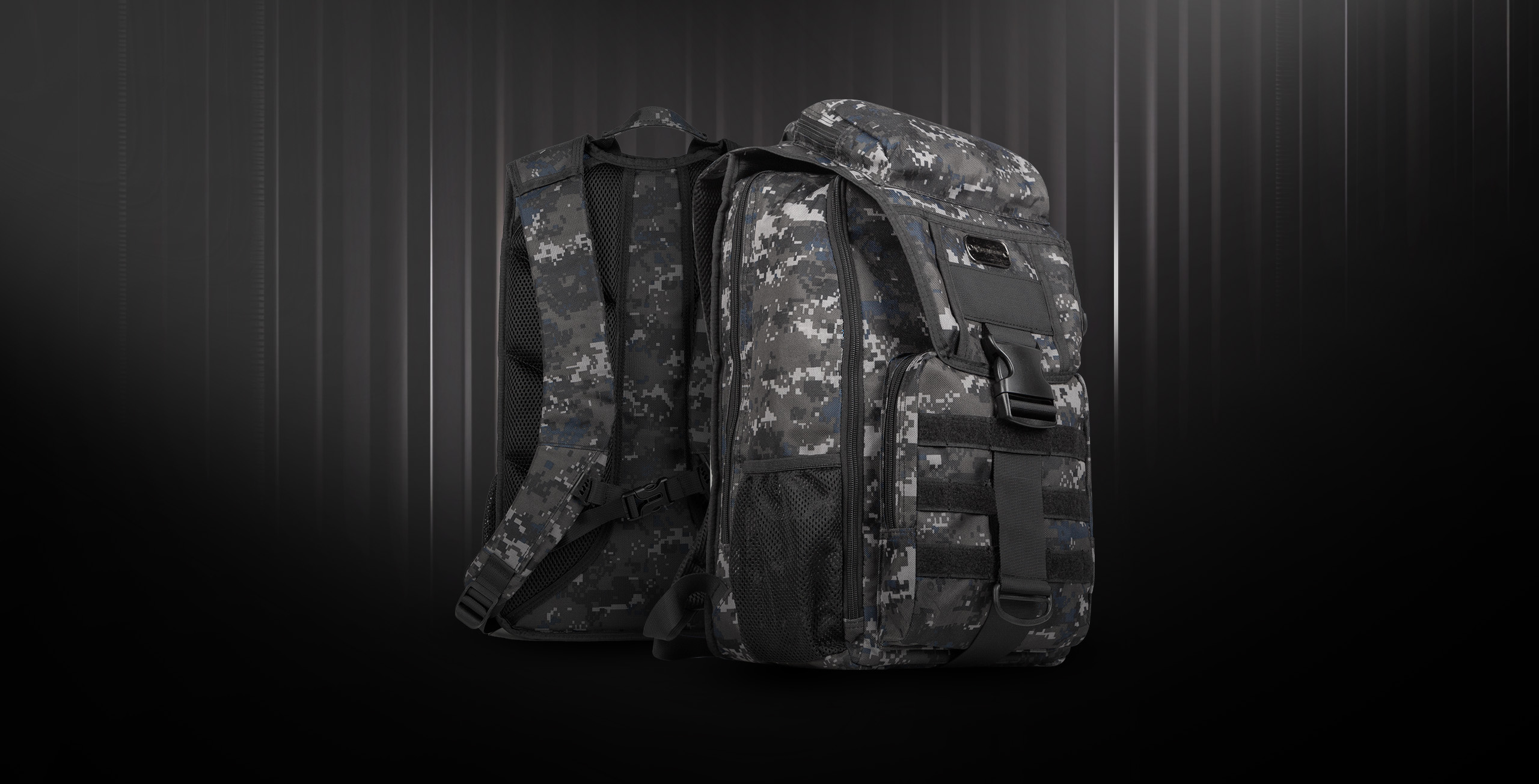
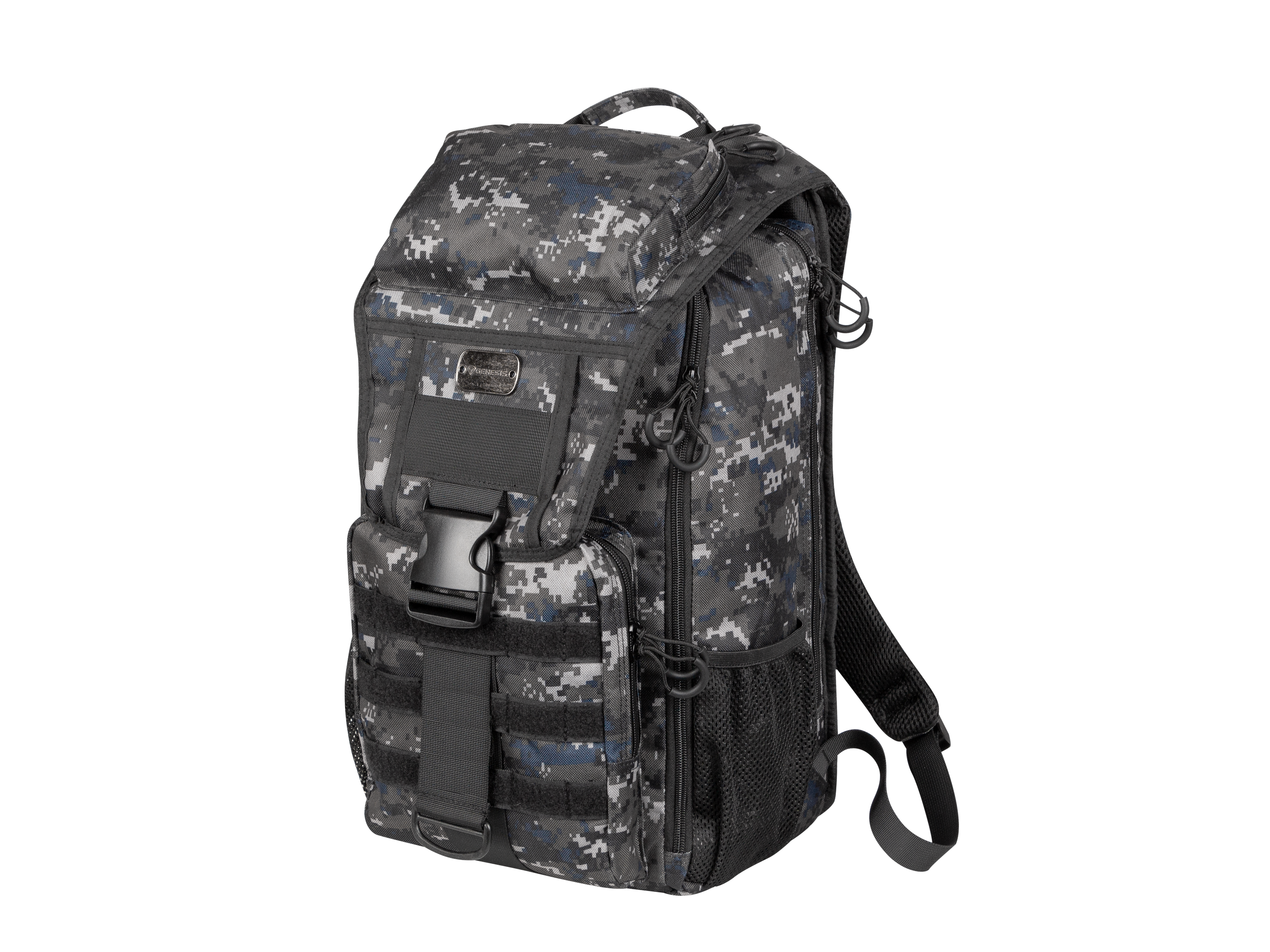
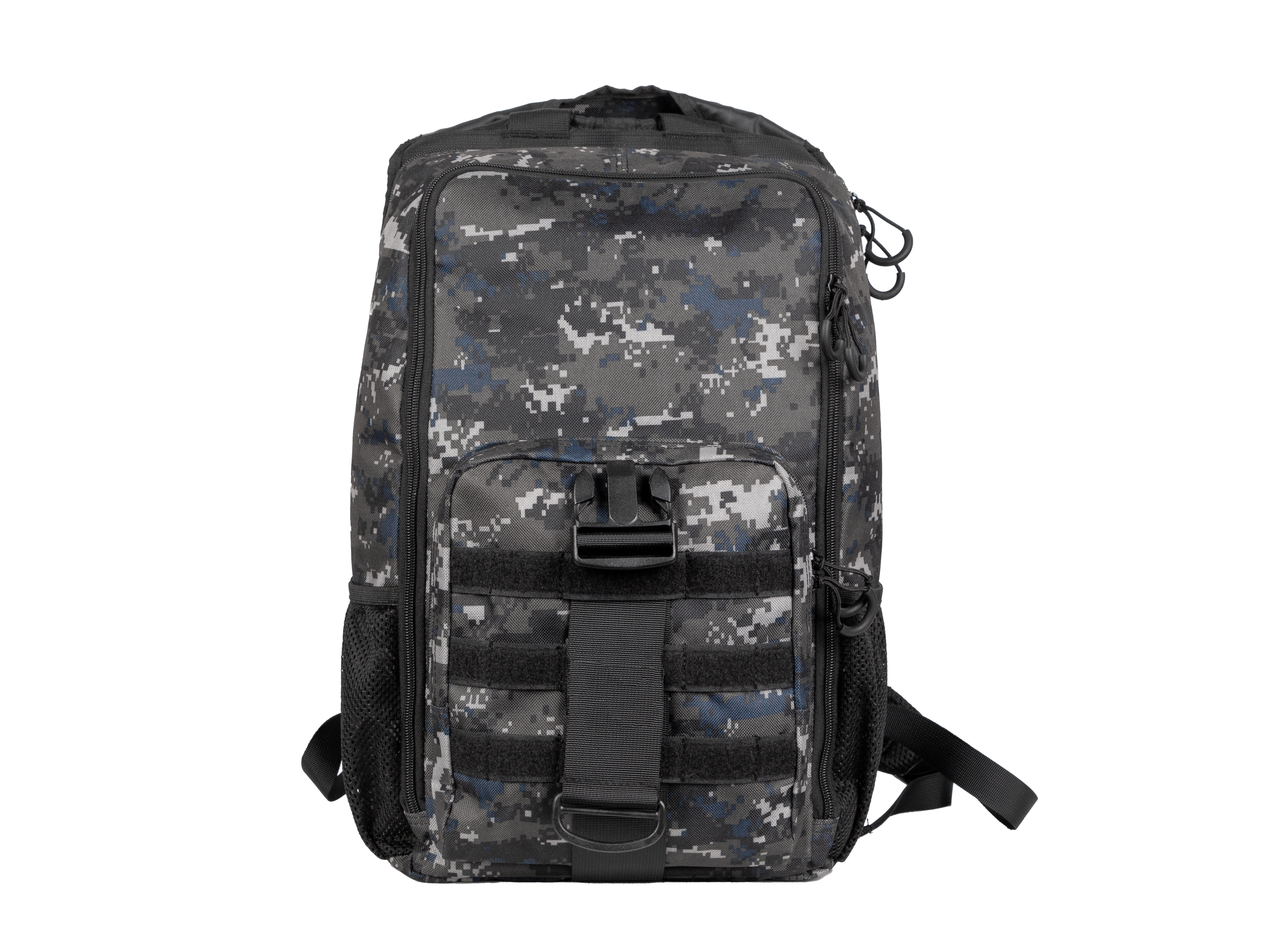
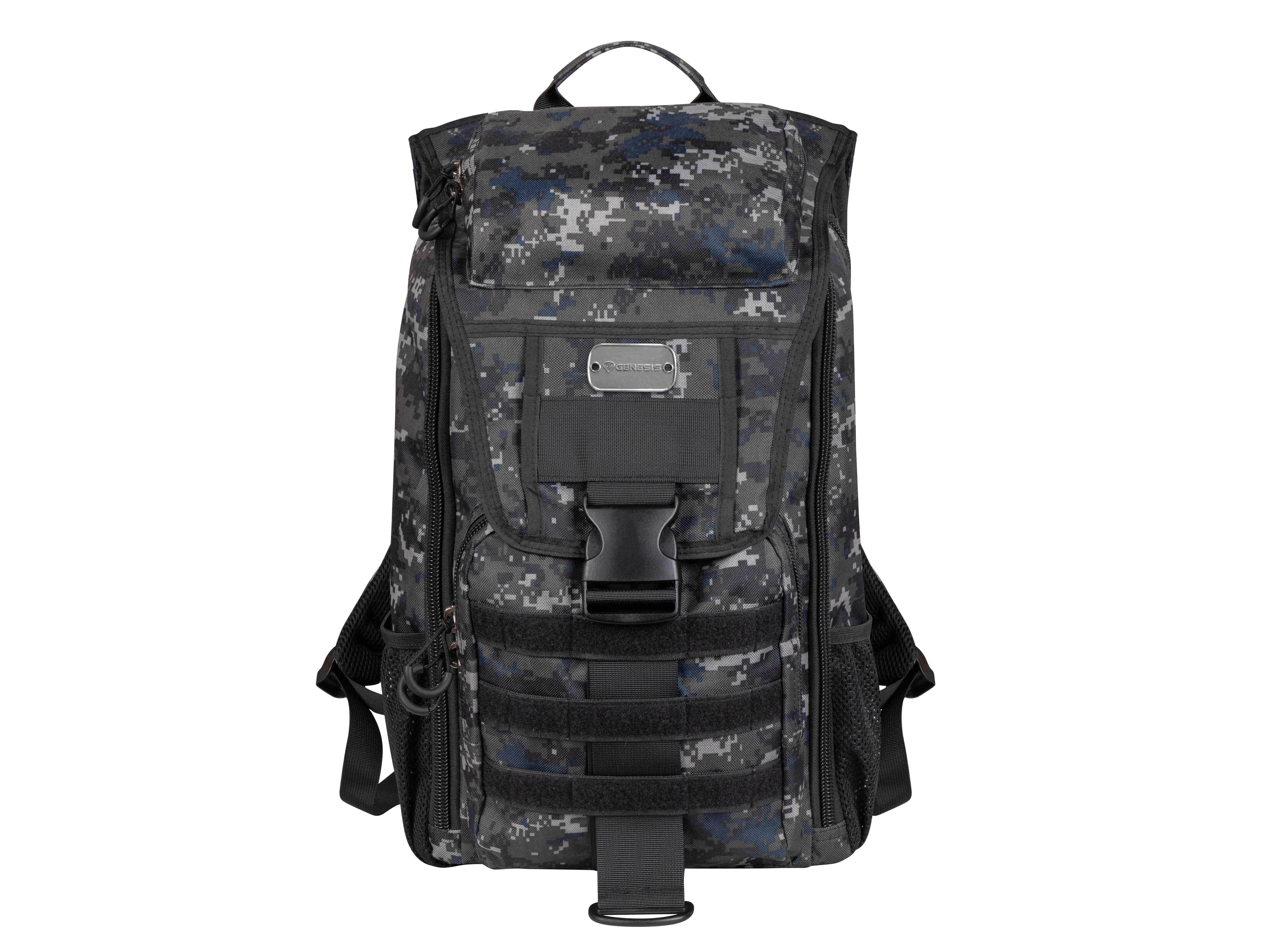
Pallad 450 CAMO LITE
Do you love the military atmosphere? Get to know the Genesis Pallad 450 Lite – a versatile and durable backpack in a unique design that will allow you to carry not only your laptop but also essential accessories. This will be made possible by the main compartment, numerous pockets, an office organizer, and even the MOLLE system, which will allow you to customise the Genesis Pallad 450 Lite to your own needs. Worried about durability? You don't have to. With the Genesis Pallad 450 Lite, you can hike even in unfavourable weather conditions. And that's not all yet.
Do you love the military atmosphere? Get to know the Genesis Pallad 450 Lite – a versatile and durable backpack in a unique design that will allow you to carry not only your laptop but also essential accessories. This will be made possible by the main compartment, numerous pockets, an office organizer, and even the MOLLE system, which will allow you to customise the Genesis Pallad 450 Lite to your own needs. Worried about durability? You don't have to. With the Genesis Pallad 450 Lite, you can hike even in unfavourable weather conditions. And that's not all yet.
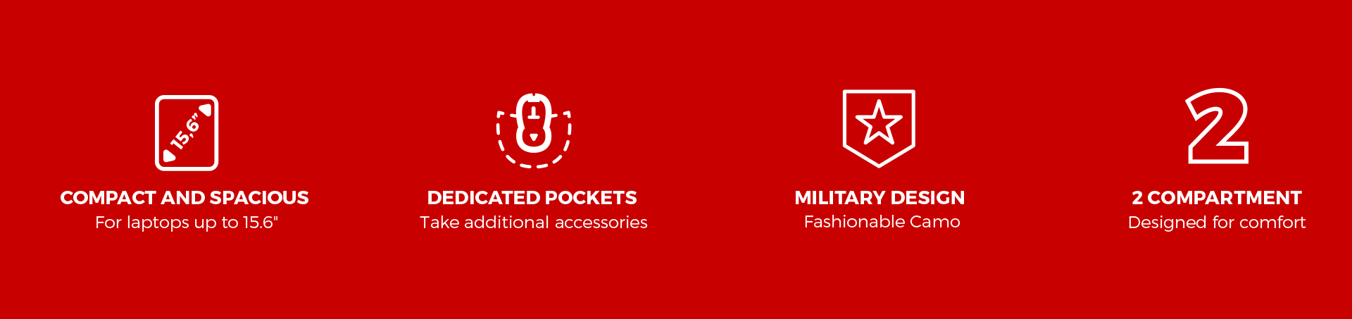
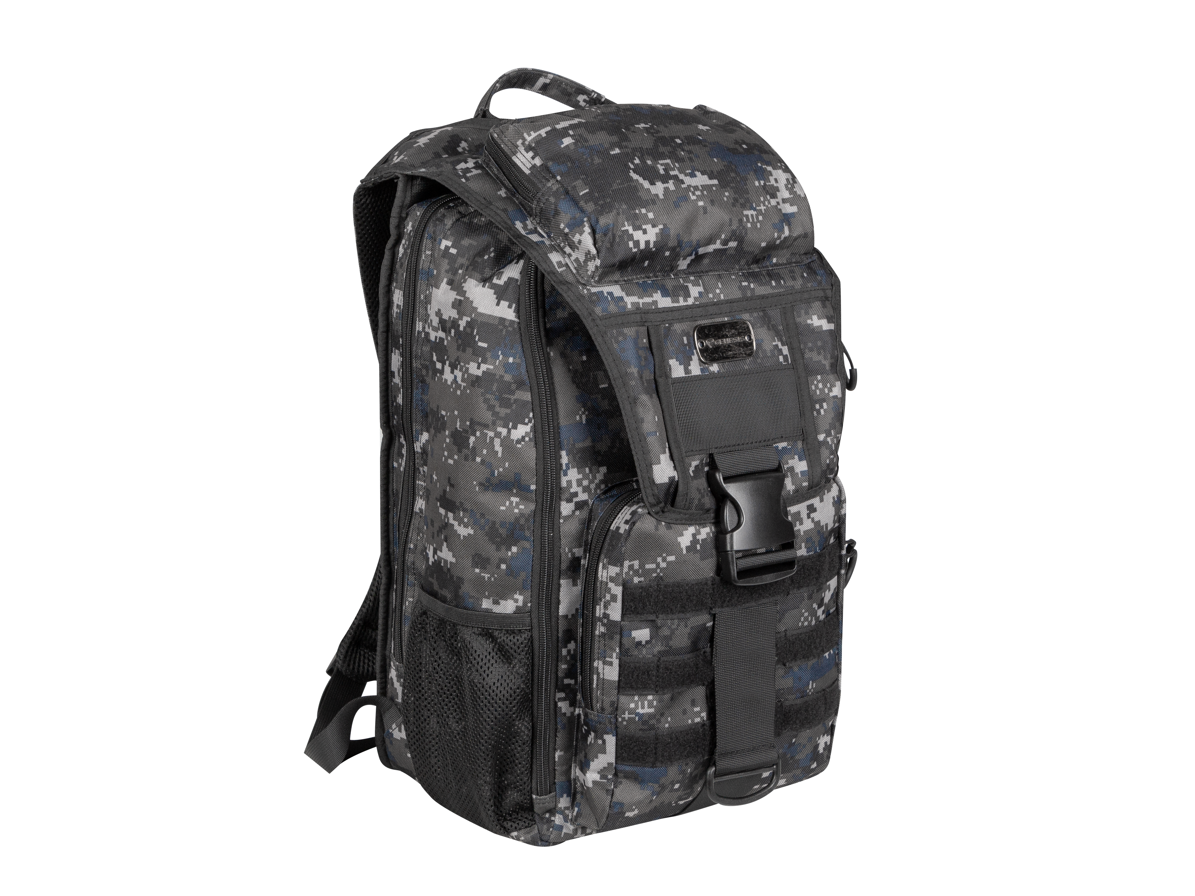
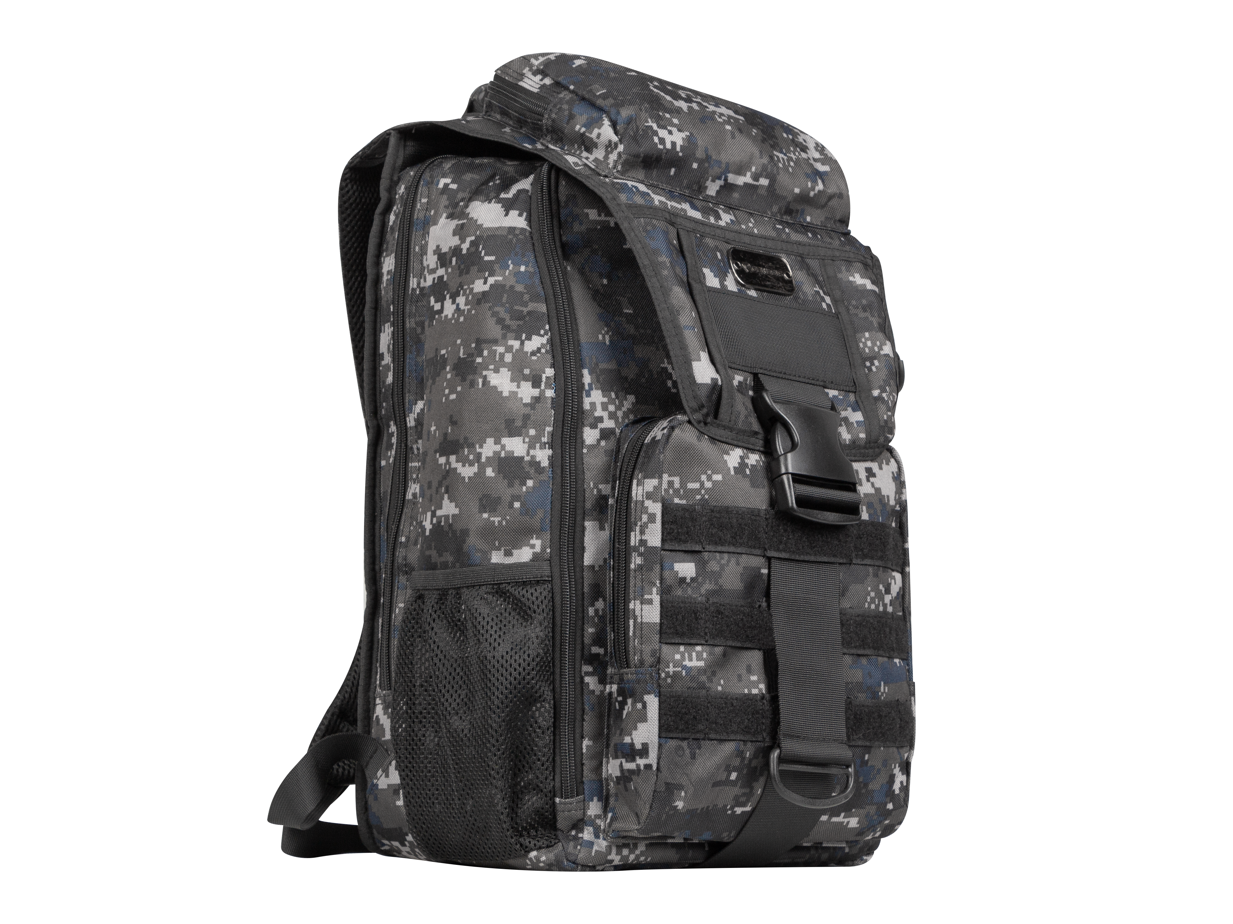
EVERYTHING AT HAND
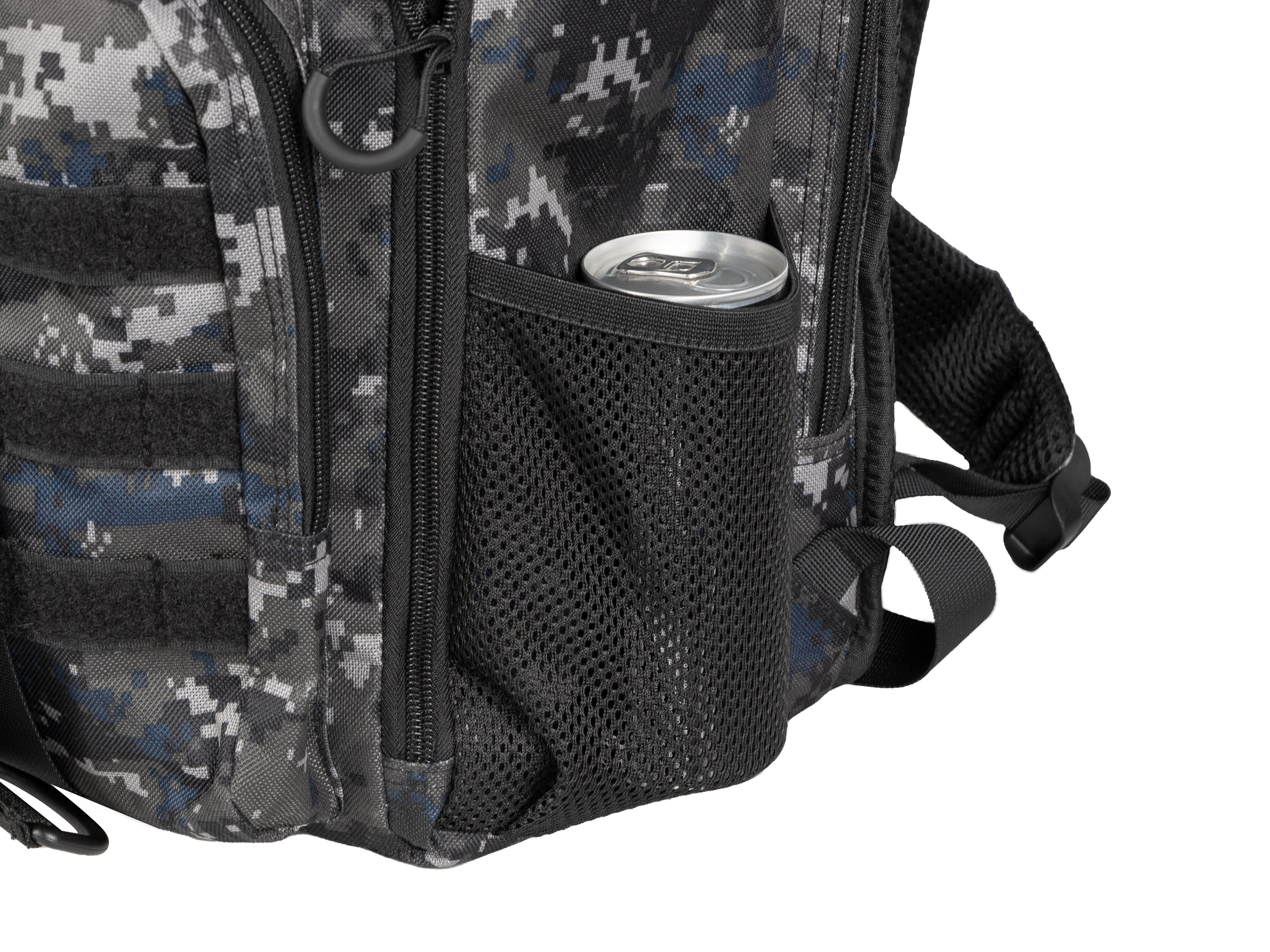
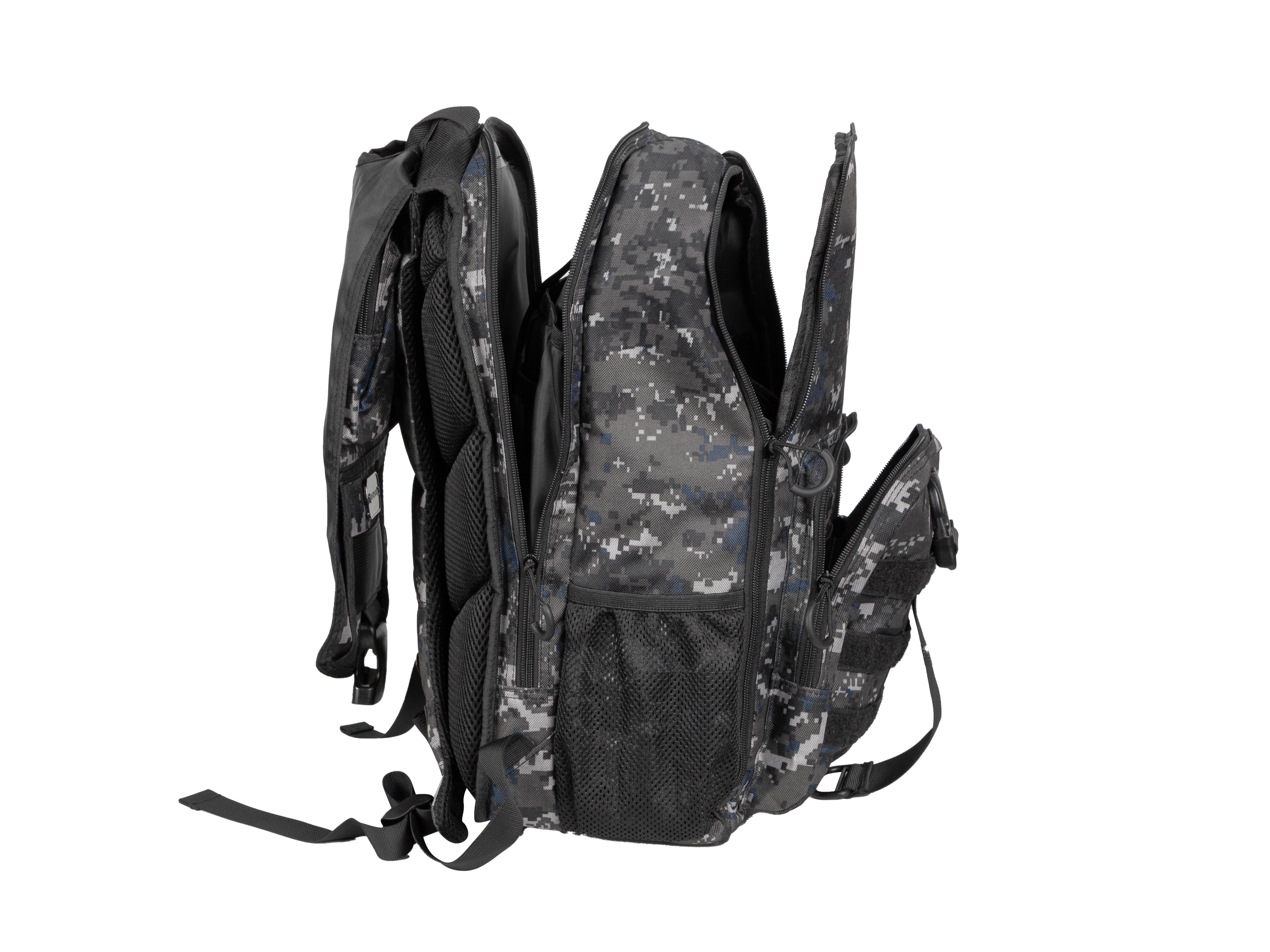
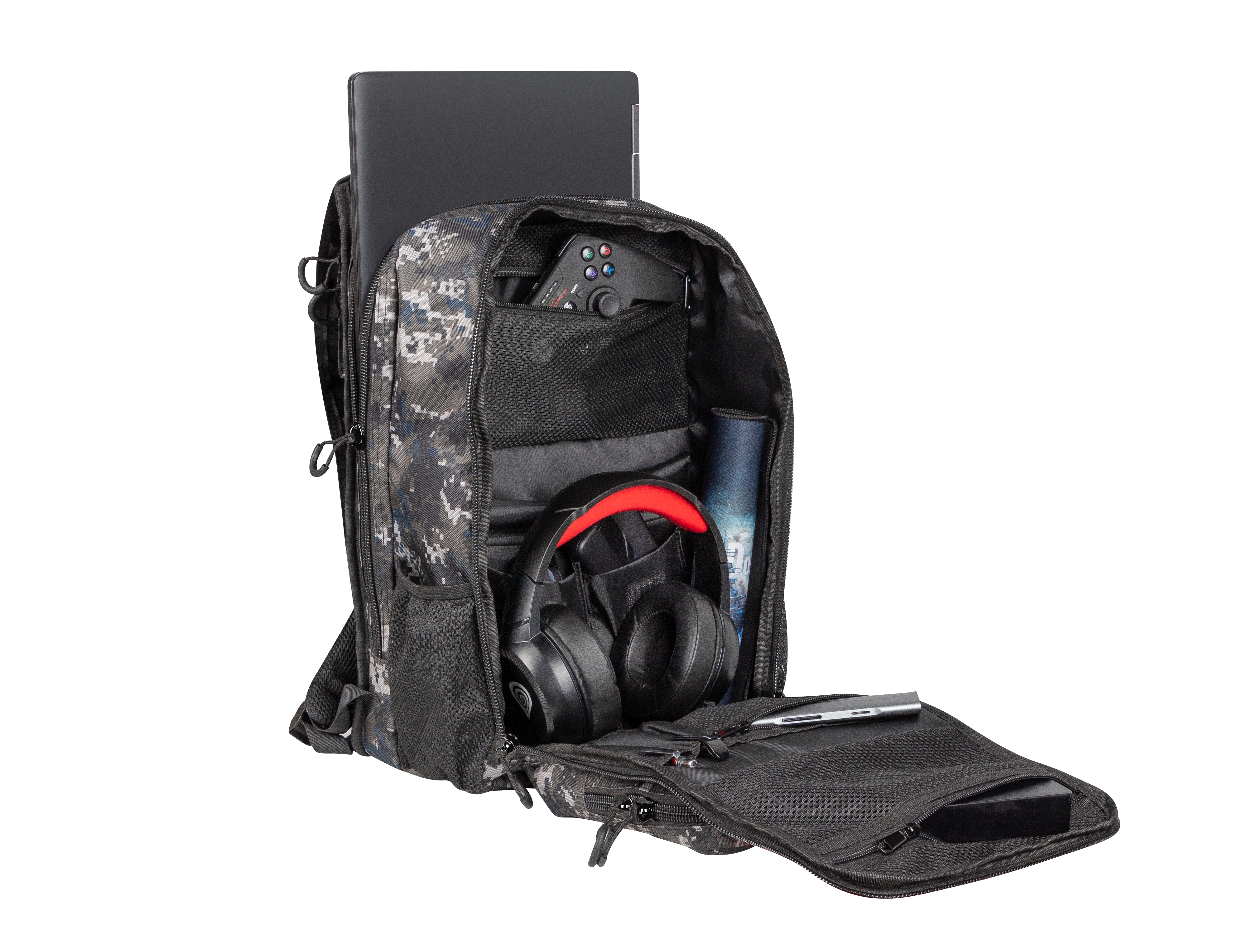
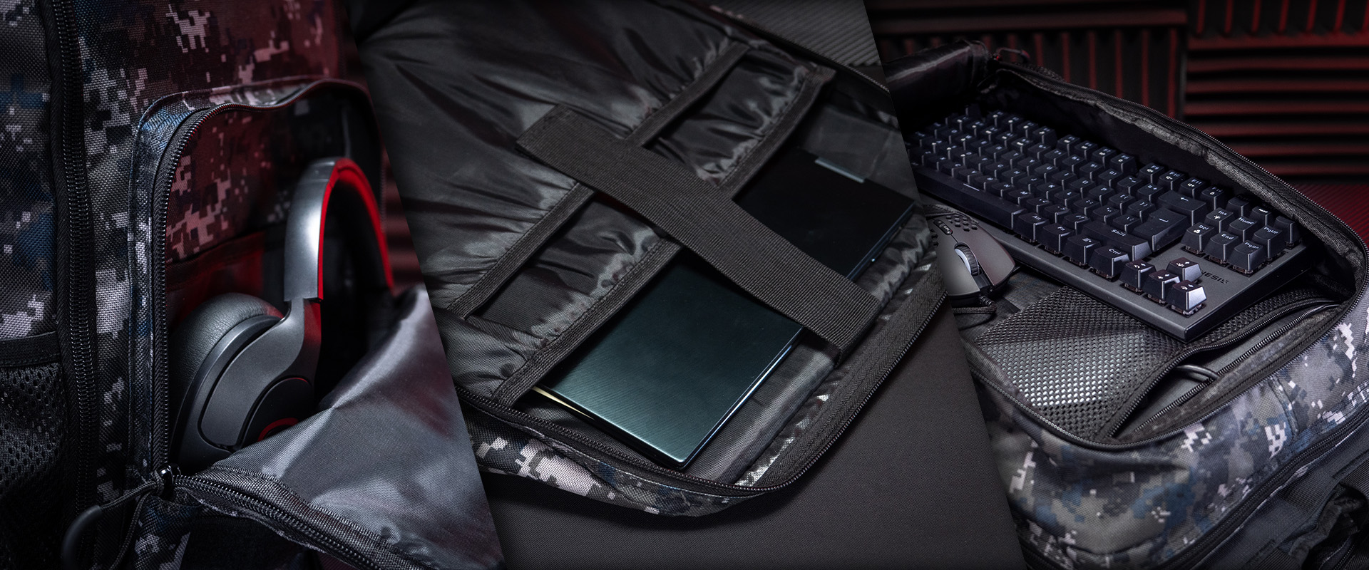
Spacious and functional. That's exactly what the Genesis Pallad 450 Lite offers, allowing you to carry a laptop with a maximum diagonal of 15.6 inches. Safety? It's ensured by the specially designed main compartment that prevents the laptop from shifting and protects it from shocks. What's more, you can easily bring your accessories along. Peripherals such as a mouse can be placed in dedicated pockets. The front panel with an office organizer will also allow you to carry essential gadgets such as pens, a phone, cards, or business cards.
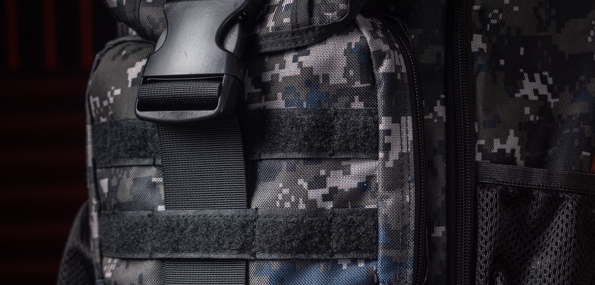
STILL NOT ENOUGH? DISCOVER THE MOLLE SYSTEM
Additional pockets aren't sufficient? For the most demanding users, we have not only provided a spacious front pocket but also the MOLLE (Modular Load-bearing Equipment) system – a modular personal equipment carrying system that you'll find on the front. Thanks to special straps, you can easily attach any accessory to your backpack. Need extra pockets for accessories? Now, that's not a problem. You can fully customise the Genesis Pallad 450 Lite to your needs.
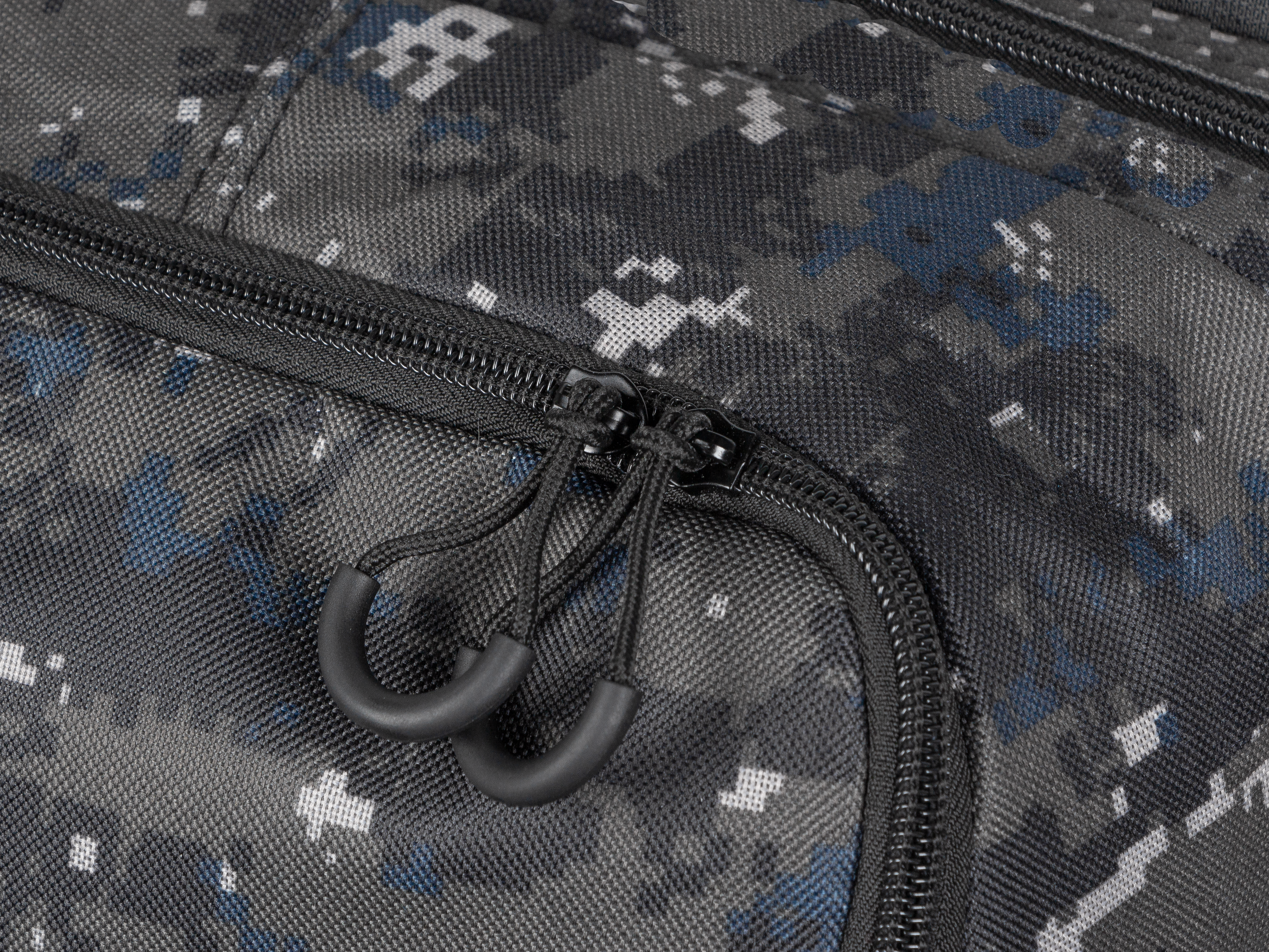
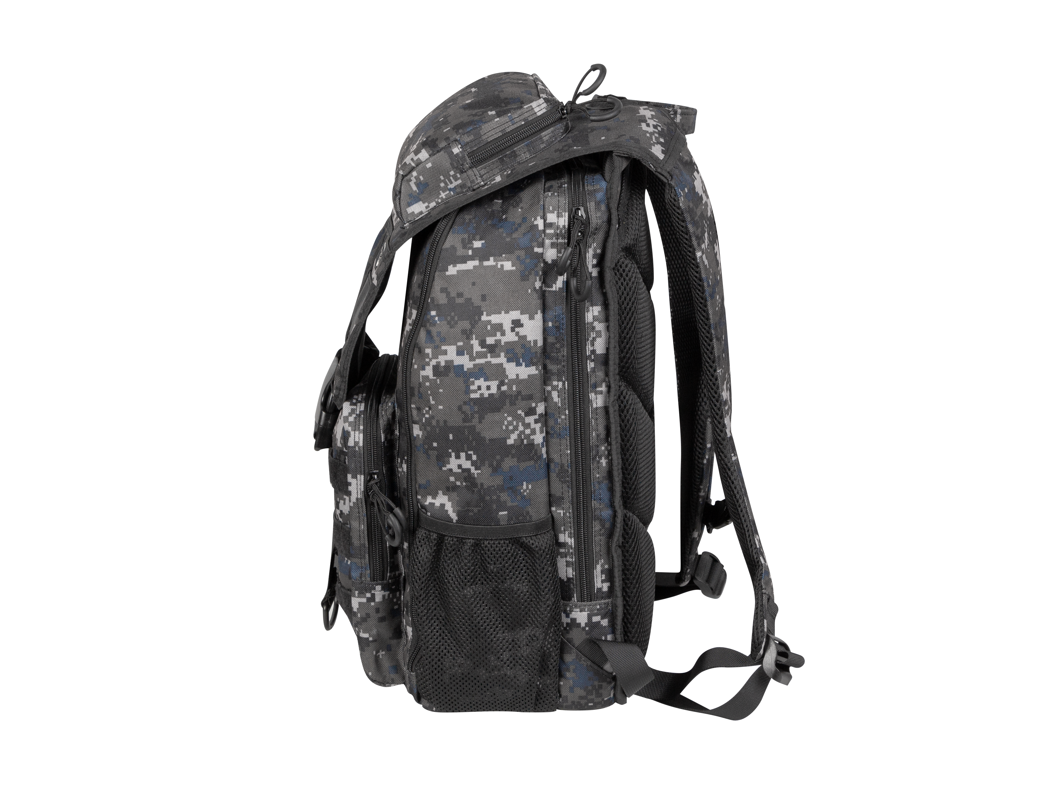
TRAVEL IN ANY CONDITIONS
With the Genesis Pallad 450 Lite, you can hike regardless of the weather conditions. Its durability is thanks to the high-quality weave and PVC. The factory-applied polyurethane coating ensures the protection of your equipment even during rain. Whether you're on your way to school, a mountain excursion, or in the city – no matter where you are, you can rely on it.

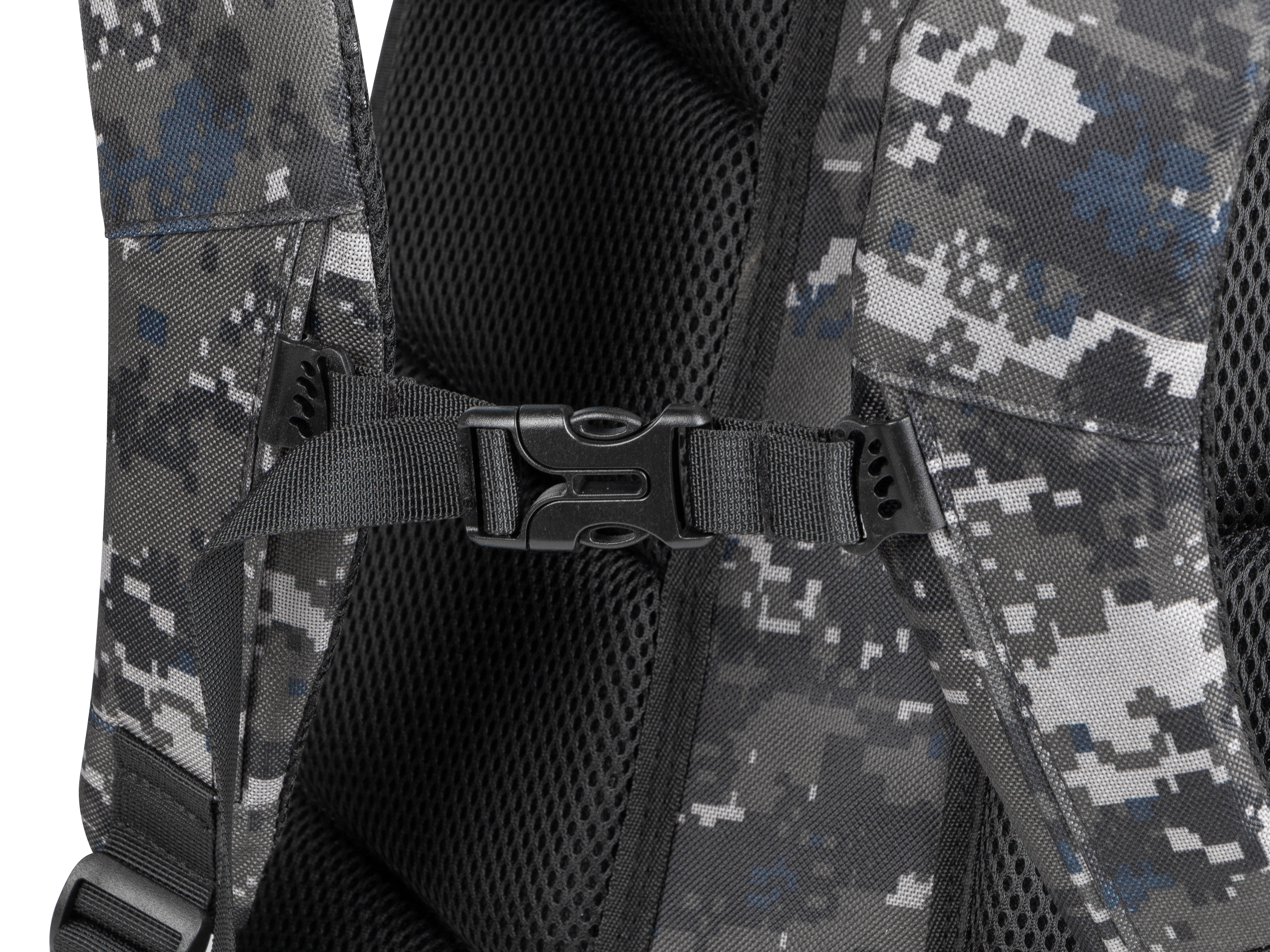
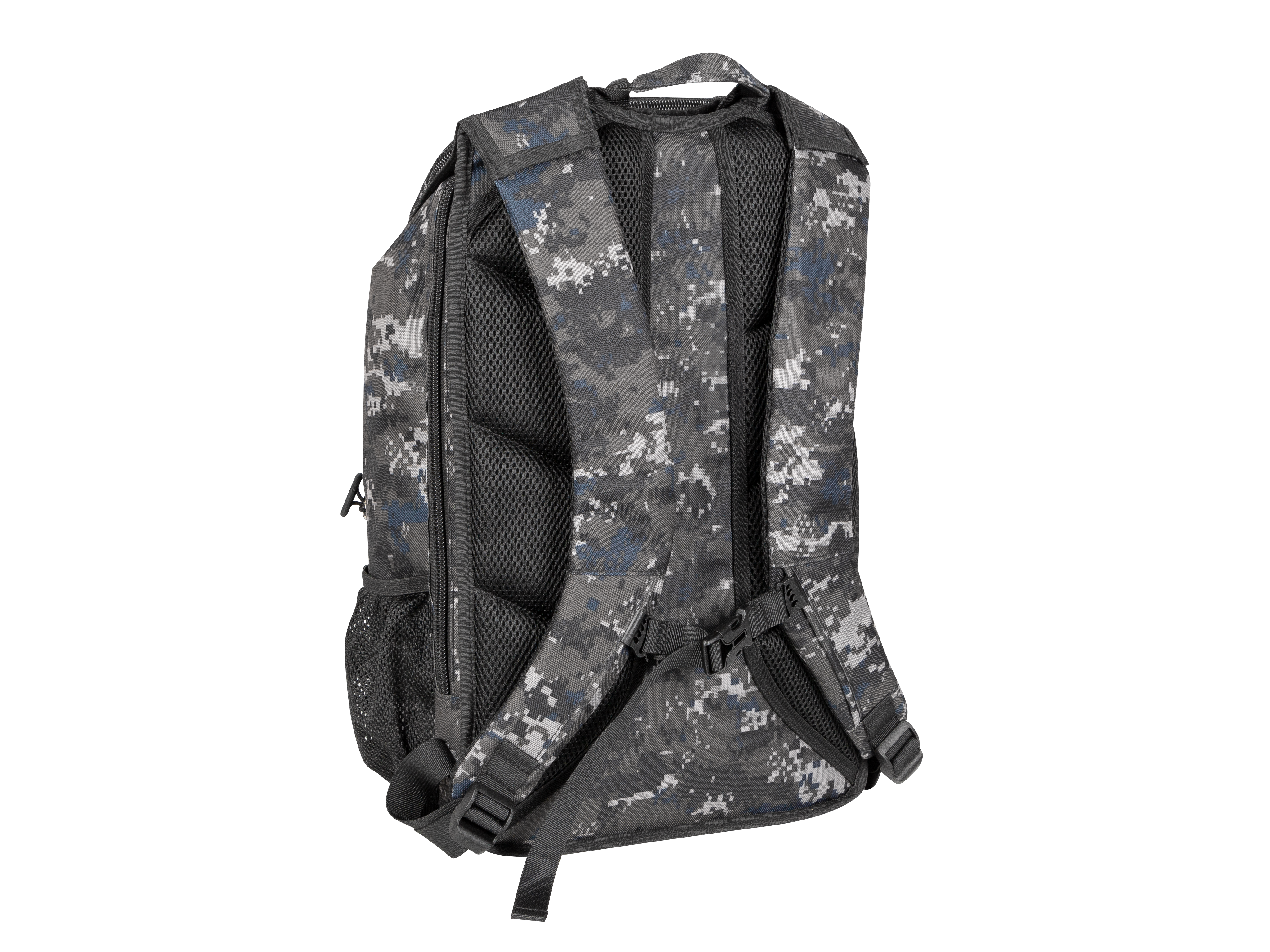
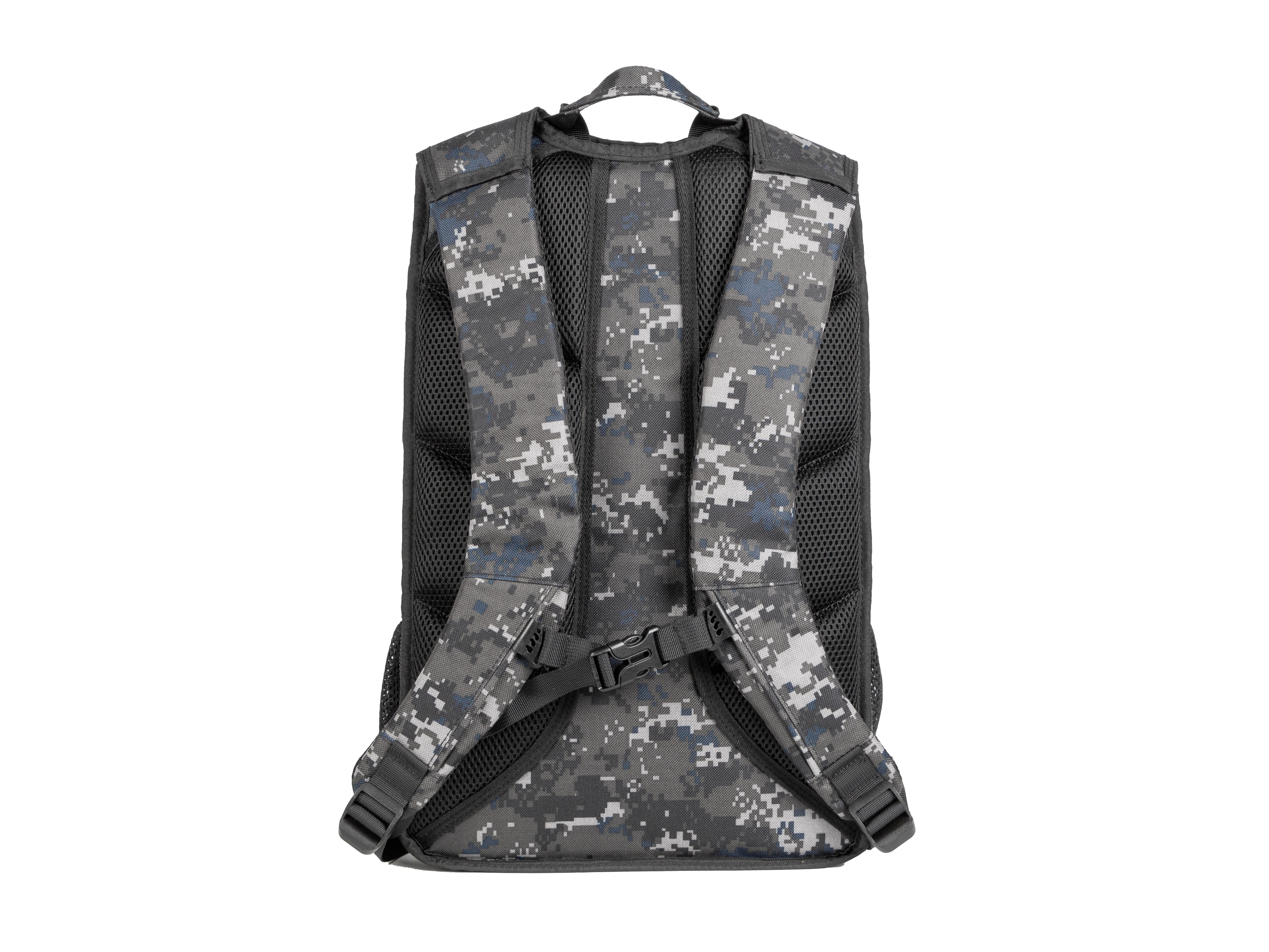
WITH YOUR COMFORT IN MIND
An adjustable chest strap, reinforced handle, soft straps that you can easily adjust to your posture, and functional side pockets. The Genesis Pallad 450 Lite combines compactness with the functionality of the military Genesis Pallad 450. Smaller, lighter, just as functional. Simply Pallad 450 Lite.


